Graph details
Posted
#1
(In Topic #175)
Trainee
Code (gambas)
- hChart.Legend.Title = "Legend"
- hchart.type = ChartType.ColumnsStacked
- hchart.headers.values = ["Uploads", "Downloads"]
- hchart.CountDataSets = cntofdays
- hchart.YAxe.MaxValue = 20
- hchart.Colors.Values = [Color.green, Color.Red]
- hchart[0].Text = "Downloads"
- hchart[0].values = [(500 / 30), 0]
- hchart.Labels ' i can't seem to do anything at all with the chart labels class
- hchart.Labels[0] = "text"
- s = [aln[2], aln[1]]
- hchart[i + 1].Values = s
the main things i want to fix are the legend text is correct, but the colour boxes do not match the colours used in the graph, and i would like to put a label or similar on the yaxes, i guess i could use a label control over the drawing area, but figure there should be someway to do that within the graph
any help would be appreciated

Posted

Guru
I could not get your code to run as it was missing bits, but I took what I could and made effort to get it running and came up with the attached.
but the colour boxes do not match the colours used in the graph
I don't quite understand what the problem is here as it seems to work OK for me.
i guess i could use a label control over the drawing area, but figure there should be someway to do that within the graph
It would be nice but I can't find out how to do this. You might try creating a new Class and add the Labels or hack the Gambas source code and see if you can understand how the Labels are supposed to work.
I expect you have looked at the Chart Example I put on the Gambas Farm.
From what I can work out from your code you seem to have worked out how to use this.
If you could upload a working program including a sample data file that might help.
Posted
Trainee
that was about 5 years ago, it looks like the programmer has lost interest in thisFirst you need to note that the Chart command has a comment of "This component is not stable yet"
here is my code, obviously some stuff is nothing to do with the graph, i will probably move the graphing into a separate procedure later, some comments to explain code for other components not required for testing graph, the code is still a bit messy as i keep trying different things, then do not always remember to remove
Code (gambas)
- ' probably comment out the tray stuff for testing
- htray.PopupMenu = Menu1.Name
- htray.Show
- 'timer at this stage only to hide the form to the tray, later to update the data file
- timer1.Trigger
- hchart.Legend.Title = "Legend"
- hChart.type = ChartType.ColumnsStacked
- hChart.Legend
- hChart.headers.values = ["Uploads", "Downloads"]
- hchart.CountDataSets = cntofdays
- hchart.Colors.Values = [Color.green, Color.red]
- hchart[0].Text = "Ave. Daily"
- hchart[0].values = [500 / cntofdays, 0]
- s = [aln[2], aln[1]]
- hchart[i + 1].Values = s
content of data file
03-06-2018 0.24 4.34
04-06-2018 0.25 3.13
05-06-2018 0.63 6.77
06-06-2018 0.47 6.89
07-06-2018 0.58 6.13
08-06-2018 0.60 7.56
09-06-2018 0.79 4.00
10-06-2018 0.29 2.85
11-06-2018 0.20 3.81
12-06-2018 0.42 6.78
13-06-2018 0.59 6.40
14-06-2018 0.28 5.10
15-06-2018 0.47 3.85
16-06-2018 0.21 3.82
17-06-2018 0.22 4.97
18-06-2018 0.28 12.48
19-06-2018 0.47 3.17
Total Used 6.99 92.04
Used Combined 99.03
Data Left 400.97
Data Left 400.97
on another note, what is maximum delay for timer?
Posted
Trainee
i am not sure why mine do not match, as i see yours are perfect, i will post a screen shotI don't quite understand what the problem is here as it seems to work OK for me.
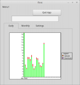
(Click to enlarge)
also i note that the screenshot above, the uploads legend looks similar to the data color, on one monitor. on the other screen it looks more like yellow, though the data columns look green, the downloads legend looks purple on the other monitor, data green
your sample matches on both monitors
i had not seen this continue before, thanks for thatFor Each aln In adt
If Not aln Then Continue
Chart[i + 1].Values = [Val(Split(aln)[0]), Val(Split(aln)[1])]
Inc i
Next
Posted

Regular
westconn said
…on another note, what is maximum delay for timer?
Timer Delay is an Integer, so max value is 2147483647ms
Posted
Guru
The attached program shows two charts, using the same data, but with different colours.
<IMG src="http://cogier.com/gambas/charts.png">
 </IMG>
Hope this helps.
Posted
Trainee
Cheers
Matt
Matt
Posted
Trainee
thank you both, it works for me too, though why did your sample work correctly without?Two of us have worked on the colour problem
also thanks to stevedee
is there any way to have vertical text?
Posted
Guru
The reason for this is that I used 'Chart' on its own and did not create a new instance. Your code had: -though why did your sample work correctly without?
My original code didn't. Have a look at ChartExample on the Farm. I did not create a new instance in that code either. You should only need to do that if you need more that one chart.
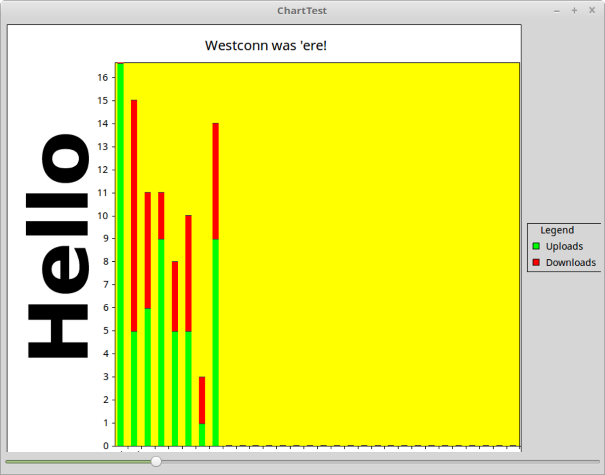
Not that I am aware of but I found the attached code written by the original author that you might like to pick apart and see if you can improve it or add extra components.is there any way to have vertical text?
Posted
Guru
is there any way to have vertical text?
Have a look at the attached.
<IMG src="http://www.cogier.com/gambas/ChartTest.png">
 </IMG>
Code (gambas)
- Paint.Translate(128, 128)
- Paint.Translate(-128, -128)
- Paint.MoveTo(-250, 135)
- Paint.Text("Hello")
- Paint.Fill
1 guest and 0 members have just viewed this.